Trilogy Friction: Inventory. Quality. Savings.
Creative directed this logo design and positioned this brake lining startup as a smarter way to purchase and manage your friction material inventory.
Lake Country Precision

Brand icon that I conceived and creative directed.
Corridor Construction Services of Iowa City

Creative directed logo design and identity; wrote tag.
NeoBrake Systems, Inc.

Creative directed logo design and wrote tagline.
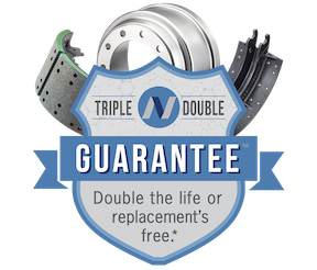
Named this product guarantee program and designed the logo icon.
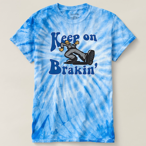
Concepted and creative directed this parody design that features "Reman Rick" – a caricature and persona I created of the company's CEO to generate more interest and appeal for brake products.
Wisconsin State Fair
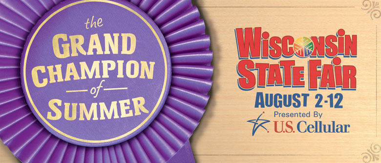
Wisconsin State Fair organizers sought to reposition their late summer event after feeling a bit upstaged by Summerfest's earlier date. So to help them reclaim their rightful place on the summertime mantel, I wrote "The Grand Champion of Summer," which simply revealed their core values without a hint of the real strategy behind it.
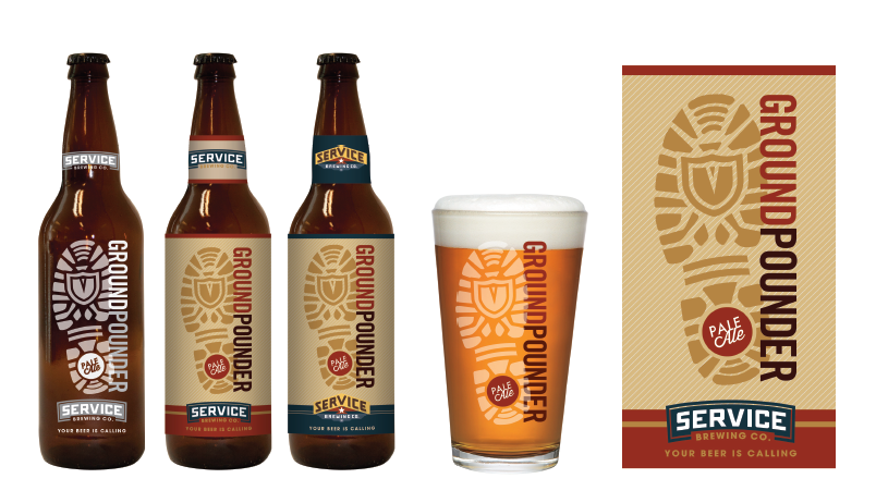
Service Brewing: Your Beer Is Calling
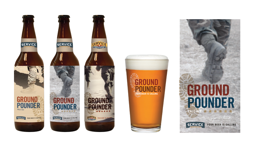
Service Brewing, a startup craft brewery owned and operated by Veterans, rallied behind a mission to celebrate, support and inspire public service at a local grassroots level. As part of the brand development and package design work presented, I penned the tagline "Your Beer Is Calling."
North Shore Bank: The Bank of You

The Bank of You is the bank of your hopes, your dreams, your way of life... and banking. The idea for this tagline was born out of the research, repositioning, and creative work I was instrumental in developing for North Shore while working at Boelter+Lincoln.
SunChemical: Giving Life to Color
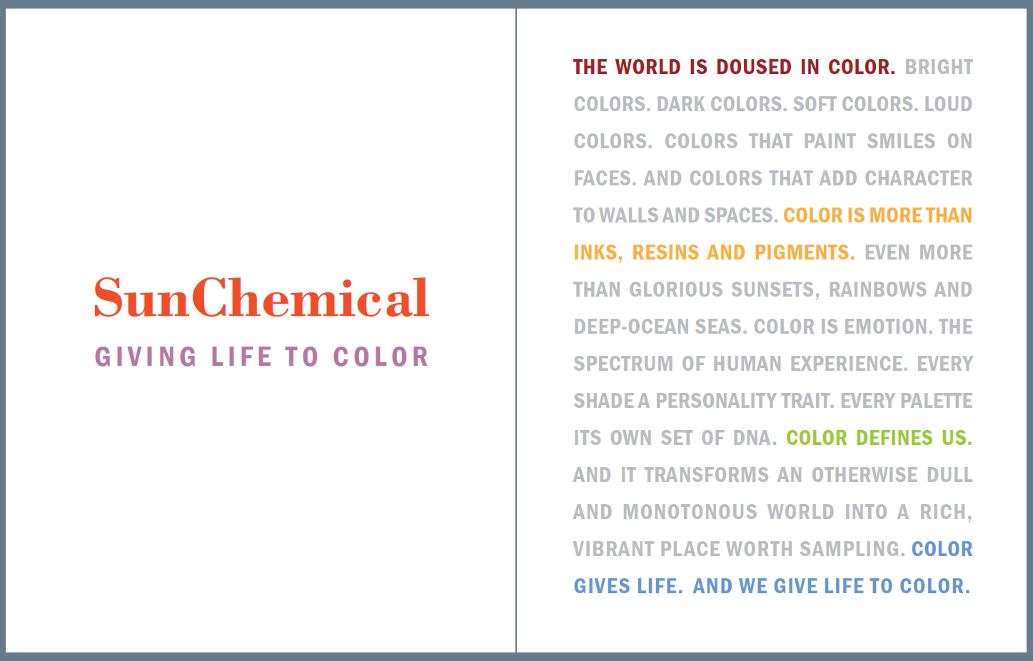
While working at Nelson Schmidt, I worked largely on B2B accounts that were national in scope. SunChemical was the parent company to one of them, and the agency was invited to pitch them a new overarching brand position that encapsulates all of their subsidiaries in the form of a corporate brochure.
As part of that work, I developed "Giving Life to Color" and wrote a brand mantra to summarize and convey the essence of our positioning. Unfortunately, their CEO insisted on hiring a NYC agency, but this creative was picked up and used by their German office. So it made an impact, even if it was by a Milwaukee agency.
The audio clip below is a recording of the mantra that we prepared and used during our presentation:
Landmark Credit Union: You're Worth More Here

Clients don't always make decisions that make creatives happy, but I had the good fortune of working with the folks at Landmark. When they raised questions or concerns, the work got better. That's rare. Just 11 branches when I spearheaded their rebranding efforts and the creative that came out of it, and today they have more than 35. "You're Worth More Here" summed up all the advantages and personalized service you receive as a member
Naming NUVO
I landed my first job out of school in Indianapolis and, before my office was even decorated, I had named the city's new alternative weekly paper: NUVO. Now brace yourself, because the genius behind this cannot be understated. I combined two words "new" and "voice." And the rest is history, as they say.
Sawalk Bearings: Genuine Quality 2.0
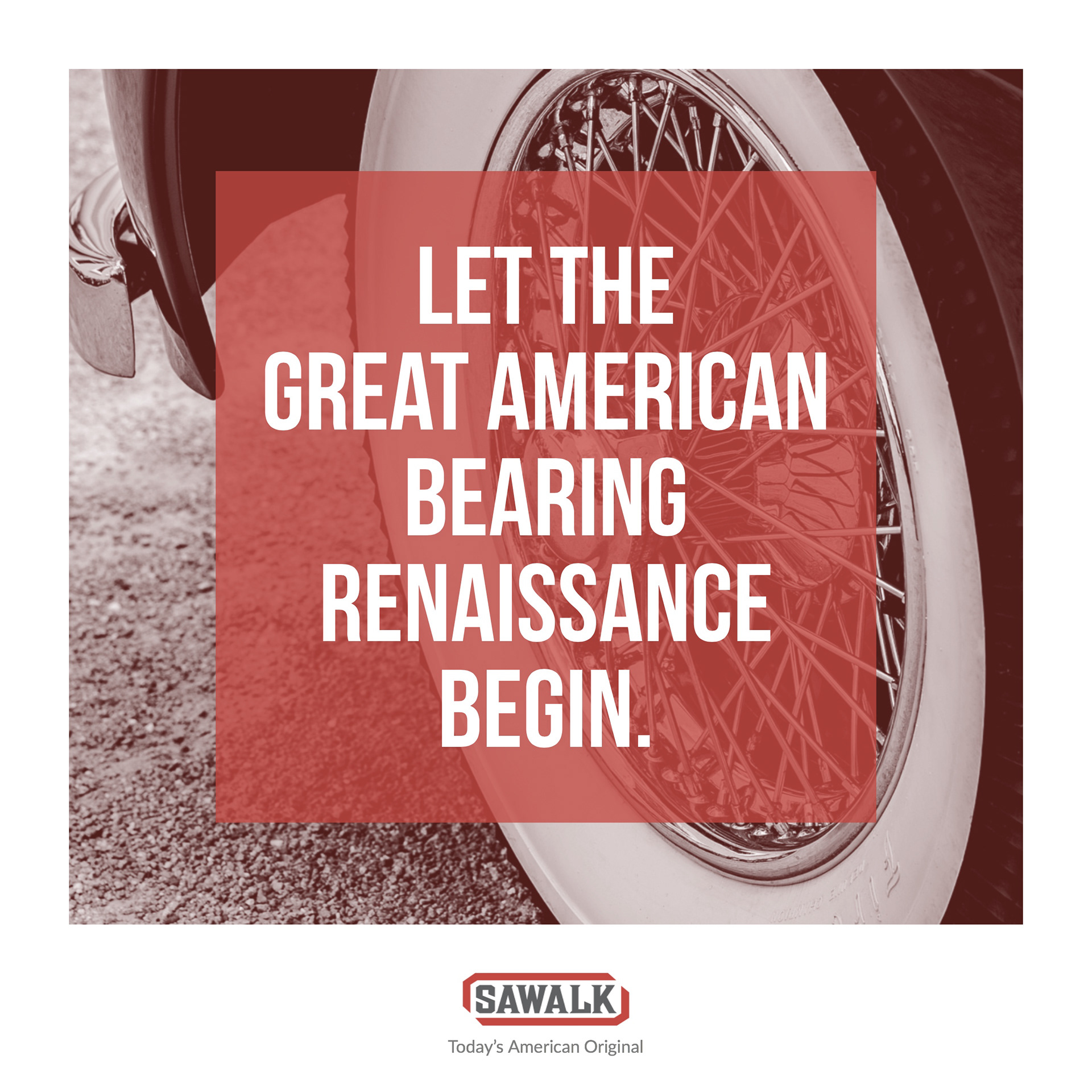
Branded, developed all creative and launched this NeoBrake venture startup.